Website Design for Civil Engineering Company
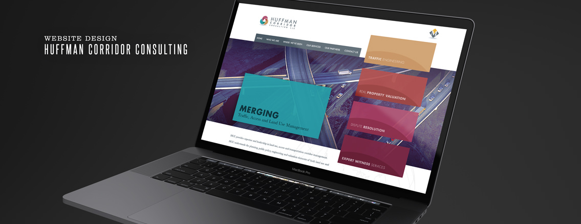
Huffman Corridor Consulting, a subset of Martens Appraisal, knows a thing or two about construction. So when they commissioned us to design a new website for them, we knew we had to pull out all the stops to show them we understood the building process too.
They wanted their website to be minimal and uncluttered, so we stripped back everything to the bare design essentials. With lots of negative and uniformly colored space, we had to be very particular about the elements we chose to spearhead the design. This meant that the typography, textures, and colors all had to be bold and robust enough to support the design concept as well as encapsulate the client’s vision.
To achieve all of this we punched up the color in the stock photo and stylized it to match our design. We added curved elements to mimic the client’s logo. We utilized every color from the client’s logo to draw the eye where we wanted it to go. We thought long and hard about the fonts, selecting them carefully so they added cohesion to the design hierarchy instead of detracting from it. The result is an engaging website, supported and emboldened by the subtle details.


