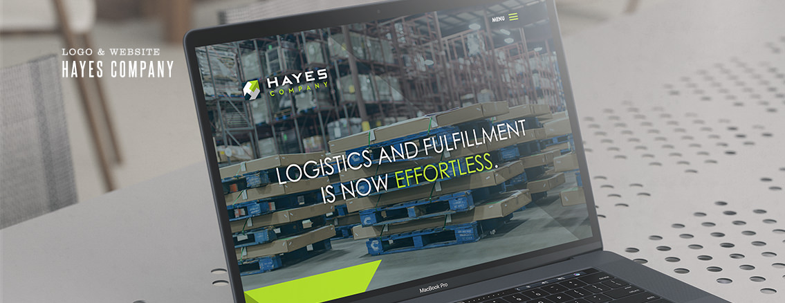
Hayes Company Upped Their Game.
“We want a modern website,” they said. “We want our updated logo on there, too,” they said. “We want to look as fresh and capable and knowledgeable as we feel!” they said. So we said, “Heck yeah you do!” And so the Hayes Company website redesign project was born. We’ve worked on three great redesigns for Hayes, a local Wichita company, over the course of our decade-long relationship. But for this one we blended movement and simplicity with their bold color palate to create a site that identifies not only with their brand, but who they are as people. Smart, thoughtful, logical… and fun.


