Why Human-Centered Design Matters
According to Ideo and their Field Guide to Human-Centered Deign, “Embracing human-centered design means believing that all problems, even the seemingly intractable ones like poverty, gender equality, and clean water, are solvable.” To incorporate human-centered design, you have to understand who you are designing for. This is the design that solves regular old problems (like how the heck do we know whether to push or pull or a door or how to create ergonomic scissors) and really big problems (how to get clean water to communities). It’s more than just product design. It involves empathy, understanding, and (maybe most importantly) flexibility.
If you need more reasons to support human-centered design, we got you. Even David Kelley, a managing partner of the design firm IDEO thinks human-centered design is cool.
How to Integrate Human Centered Design
According to Design Kid, human-centered design includes inspiration > ideation > implementation.
Inspiration: The first part of human-centered design is listening to the people you’re hoping to serve. Make sure you are adjusting your reading level for your audience. If you want to create a new way for people to drink water, you’re first going to want to understand what they’re doing now, why it is or isn’t working, and what they actually want. But this sort of design-think can apply to more than humanitarian needs–everything from cups to underwear can be designed using a human-centered method.
Let’s say your job is to engage students at your school. How do you approach the problem? Some teachers would start by teaching their lesson plan as it is. But others would leave space for feedback. What do the students actually want? Are they dying to experience more hands-on activities? Are they begging for more time for play-centered learning? Do they ask you daily to get into group activities? It might be time to listen to them for once. The best way to integrate human-centered design is to taken notes. And finally, leave room for innovation. Notice whenever someone says something about your project. Notice how real people are attempting to use your product, even if it’s not the way it was intended. Listerine, for example, was first developed as an antiseptic; it wasn’t until the 1920s that it found its perfect form– as a halitosis cure.
Ideation: Take your information from the inspiration phase and come up with as many ideas as you can. Prototype them. Test them out. See what works. Ideation is like a giant brainstorming session. There’s no wrong way to brainstorm, though there are some tried and true techniques that you can explore during your ideation phase.
Implementation: This is where you can keep your goals in mind while you attempt to implement your design solution into the area you’re trying to serve. After you implement the new plan, leave room for feedback.
When you’re working on a tangible product, the humanness of it can come a bit easier. You can imagine how real people will actually use it. Take the door, for example. Vice recognized that there are bad doors all over the place. A door is the kind of object that gets forgotten about pretty easily…when it works properly. But when it doesn’t? You get a whole lot of this:
The Norman Door is named after Don Norman…you know… he’s just the dude who helped create the Nielson Norman Group (!!!). And it’s what happens when designers don’t think about use. A Norman Door is a door that has such poor design, you don’t know whether it’s a pull door or a push door. And like the Vox video says, if you keep messing up a door over and over again, it’s probably not your fault. Good human-centered product design looks a little something like this:
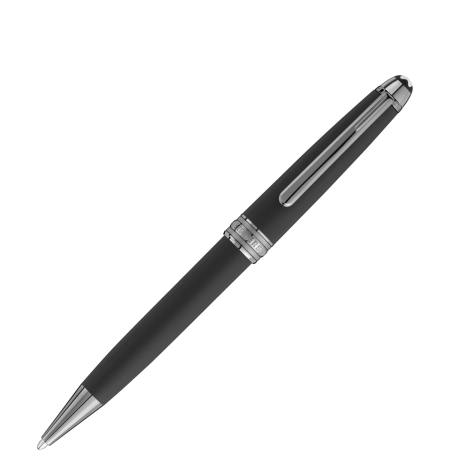
Some designs haven’t changed much since their first iteration. That’s not because no one is innovative; it’s because the design is so perfect that it doesn’t need to change. The nib may have gotten narrower or wider depending on use, but there was always ink flowing somehow into a nib. In the 1880s, Alonzo T. Cross applied for a patent for one of the first iterations of the ballpoint pen. This design used air bubbles to push ink to the nib. Users no longer had to dip their pens in ink. In 1888, another guy named John J. Loud launched the first ballpoint pen into the world, and it’s been smooth sailing since then.

This safety razor from West Coast Shaving is a good example of design that blends human-centered design and stunning aesthetics. The safety razor was easier to use than the previously common straight razor, and it led to a whole nation of young people dreaming of shaving. Without human-centered design, the razor may have never evolved into the safe, sleek form that we’ve come to love.
Human design helped show a company why their treadle pumps weren’t selling (hint: the hip-swaying involved in the operation was deemed inappropriate in the cultures they were trying to sell to). It’s what makes people think about each other when designing offices, and it’s what turns algae into a life-saving product. The book All Marketers Are Liars by Seth Godin talks about an interesting phenomenon. No one in New Hampshire has a doorbell. “If you’re a friend, come on in. If you’re a stranger, go away.” Using the same approach across all houses wouldn’t make sense. Human-centered design sets it apart.
So how do designers even think about human-centered design?
Thinking Humanly
Delivery architecture is what we do when we want to convey a specific goal and use the feedback about that goal to make sure we made our point. Discovering the problem isn’t enough. We can’t only think about the “why” of things, we have to also consider what, who, how, and where. So we have a door. Why? So we can keep the elements out and create a safe way to get to one place or another. But that doesn’t tell us anything about how we should design the product, when people are going to be using these, where they function best, or what they stand for.
And this isn’t just true in product design– it’s true also in web design. Don Norman talks about how Google’s “non-error message” helps people figure out what they mean.
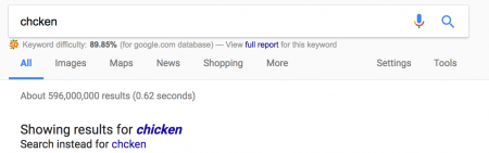
There’s nothing confusing about the non-error message. You see that Google helps you make the best decision– even if it’s one you didn’t know you needed. That’s subtle. That’s beautiful. That’s what human-centered design can do. The starting point in design differ, but the end-goal should always be the same: the user’s happiness. Sometimes, happiness comes with ease of use. All design, no matter whether it’s for products or for web products, need feedback. Feedback helps the user know they’re properly using something. Without feedback, we’d all be pushing pull doors and using hair clips as bookmarks.
Examples of Feedback in Product Design
Feedback is the light that comes on when you plug your computer in. It tells you the plug is working correctly. It’s the keyboard sound when you type. It’s the locking sound a door makes when it shuts behind you. And feedback is super important in human-centered design because people need feedback to know they’re using something as it was intended.
Jakob Neilson points out an important distinction about users and design:
Users are pragmatic and concrete. They typically have no idea how they might use a new technology based on a description alone. Users are not designers, and being able to envision something that doesn’t exist is a rare skill. (Conversely, designers are not users, so it doesn’t matter whether they personally think something is easy.)
Feedback in Web Design
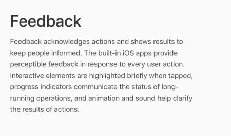
So people need to receive feedback when they use a product. It’s not enough to create a product that does what we think it does. Apple talks about how feedback functions in their app development.
Haptic Feedback
In UX design, haptic feedback is touch-based feedback that lets a user know there’s an error, an update, or an important notice. It’s what makes your phone vibrate when you touch a certain key, what makes your video game control vibrate when you’re interacting with the game. But really, all good user interface involves appropriate feedback. Users should be:
- Properly led through a cycle
- Able to tell how close they are to a goal
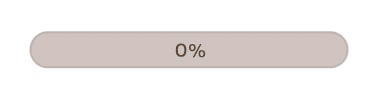
Feedback can come in many other forms:
- Progress bars
- Gesture-friendly feedback
- Hover feedback
- Highlighted buttons in forms
- Content loading bar
Feedback shows the user where they are, where they’re going, and how close they are to getting there.

Loading bars let the user know that something is happening in the back end, but progress bars tell them how far away they are from getting where they need to go.
Where to Go From Here
You don’t have to change your entire methodology, but you can incorporate some tools from human centered design into your own plan.
- Evaluate your current process
- Develop a persona for your clients to better understand their challenges
- Develop a productive brainstorming session to generate new ideas
- Pitch your plan by illustrating your ideas
- Share your design concepts with your team
- Explain your value proposition
- Explore potential risks
- Discover your differentiators
- Ask for feedback from the group you’re hoping to serve
- Get back to the grindstone and refine
The most important lesson to take from human-centered design is that you should keep things fluid. Don’t get tied to a particular methodology, don’t stubbornly refuse to innovate, and always keep your goals in line with the heart of the matter. Put humans above the bottom line and you’ll never go wrong.