Welcome to the Responsive Age: Contech USA
One of our longstanding clients came to us and asked what they could do to improve their site. We were bubbling over with ideas – not because the site was bad, but because improvement is an ongoing thing, and we wanted to see them keep up with their competitors.
So we just started talking it out. Did they have any new goals? Had their services changed? Were they trying to reach a new target audience? After discussing with our client how their business has shifted, adapted and grown over the past few years, our conversation landed in an expected spot: mobile accessibility. They’d been noticing more and more of their customers and potential customers attempting to access the site on a cell phone or iPad. That was all well and good because we built the site to perform on a mobile device. But the fact was, technology had advanced since we first launched, and it was time to be brutally honest. Their customers’ mobile experience could be better.
And so we decided to do the thing that would bring Contech into the mobile age faster than anything else. We’d make the site responsive.
- Click here for a refresher on the responsive movement.
- Click here to find out why we think 2014 should be the Year of Responsive Design
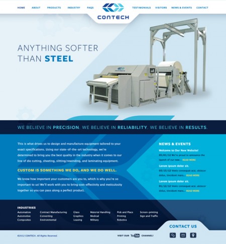
Assessment
Once we decided responsive adaptation was the best way to go, we did a
general assessment of what we were working with. The site doesn’t have a complex e-commerce system, and it doesn’t flash, twirl or bang. But it is clean, dynamic, and easily navigable, which is ideal for customers who are looking for information on products and industries served by Contech. Our client has also been very diligent about keeping the information updated, so the content perpetually changes.
Design Direction
We knew we had to keep the most important information easily accessible no matter what screen size the user was viewing. For Contech, that was “Products” and “Industry.”
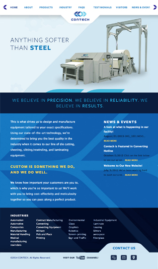
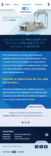
Custom Navigation
With responsive design, it’s sort of become customary to put the top level navigation into a collapsing menu at small (smartphone) screensizes. You tap the menu button, which is often indicated by three lines, and then you can choose from the resulting dropdown of menu items. But with Contech, we decided to do something a little different.
In order to keep “Products” and “Industry” within view at all times, we decided not to collapse the menu at all, but rather implement a scrolling top navigation instead. So now, all the user has to do is tap the arrows (which, we might add, were plucked right out of the logo for brand consistency) to see more navigation to the right or left of the page they’re currently on.
The Finished Product
Transitioning a static site to a responsive site presents its own set of challenges, challenges we’ve grown quite fond of, actually. We truly believe design is a problem solving adventure, and without challenges to overcome we might not ever improve as a company.
We’re happy to announce the launch of Contech’s responsive website design! Check it out, here: http://contechusa.com/.