Know Yourself and Good Design Will Follow
So you’ve been paying people to design things for you. Fliers, direct mail pieces, landing pages, everything. It’s usually a tedious process, a lot of back and forth. And it’s a fun challenge, one we’re always up for.
But we’ve been thinking: How do artists get away with just “throwing something together?” And why doesn’t this work when we’re working with our clients?
Here’s one example we just blogged about.
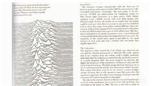
Comparative path demonstration of frequency from a signal of a pulsar (Cambridge Encyclopedia of Astronomy)
This isn’t a design. It’s a data visualization. When Joy Division was recording their first record in the late 70s they said, THIS was what they wanted on the cover. Then co-collaborator Peter Saville “designed” it (Read: set it on a black square and inverted the colors.)
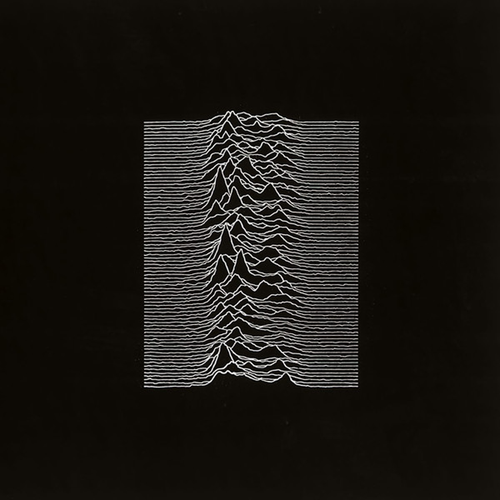
Joy Division–Unknown Pleasures (Factory Records, 1979)
How was this even work, right? Well for starters, there’s an unsettling, electric quality in the image. It feels almost “futuristic” yet very minimalist, something that could also describe Joy Division’s influential music.
And now Dirty Beaches, Alex Zhang Hungtai’s independent solo act, is gaining underground acclaim. He’s released a new double album this month.
Here’s a photo of Zhang Hungtai.
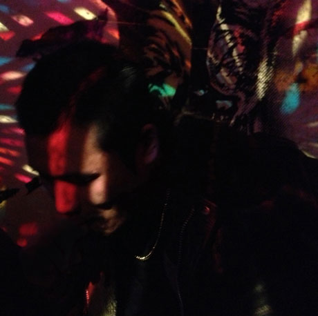
Alex Zhang Hungtai aka Dirty Beaches (photo courtesy of Shubhayan Roy)
And here’s the album cover for the new double disc Drifters / Love Is The Devil.
Dirty Beaches–Drifters / Love Is The Devil (Zoo Music, 2013)
Notice anything? Exactly. They’re the same. You’re probably kicking yourself. How does someone get away with slapping a photo on a space and calling it “design?”
The trick is that design is visual communication. It’s so elementary but it’s worth repeating. You are hiring designers like us, and we’re creating visual elements to “communicate” for our clients.
Here’s the wonderful thing. This album cover is PERFECT. Take a quick listen to a track from it.
It’s sparse, dark, drawing immediate comparison to Krautrock predecessors like Can, Amon Düül, Kraftwerk, or Neu!. It reminds you of a night blub in a woebegone era that you might be nervous to enter.
Now look one more time at the album cover.
Listen the Wurlitzer-esque synth tone in the background (reminiscent of a stubborn carnival calliope). Don’t those remind you of the colored lights hovering around the borders? Now look at Alex, shaded completely. Listen to his voice. Masked by effects. And that bass line, it’s still going. It’s motorik, transporting you somewhere else. Now look behind Alex. Do you see it? There’s an impression of a tiger, something that could be chasing him. It turns out that this artist was born in Taiwan and raised in Canada, and admits to creating work based on the idea he had no geographic “home” but a collection of memories, a nostalgia which follows him. It’s wonderful: This record sleeve LOOKS like Dirty Beaches SOUNDS.
Cool, right? But, how does that relate to you? Simple. You need to know WHO you are, what you value, and what you represent to your audience. The better you know YOU, the easier it is for you to identify things that reflect you (as Alex did in choosing this photo for his album cover). It’s also easier for you to explain what you’re looking for. It’s a powerful thing. Your understanding sets up your design studio (cough, cough, us hopefully) to execute work everyone can take pride in.